Pages

Friday, August 19, 2016

Mini Golf FUN - August Scrap Our Stash Sketch +3 Challenge

It is time for another SUPER AWESOME Sketch +3 Challenge from Scrap Our Stash!  LOTS of opportunity to use the "Stuff" you've got ( and maybe make room for some new "STUFF!" )

Take a look at the sketch below, and let it inspire you when creating your layout.  You must also Select (1) Item from each of the Lists (1,2 and 3) and include that element in your layout. ( Yes, you can pick more than one from each List - but you have to pick / use at least 1 per list!)


Here is the September Sketch with Lists noted below it:
I used the following items from my stash for the lists:
List 1 - "Various Mfgs (3) or more" :
Jilliebean Soup ( Yellow )
Cosmo Cricket ( Strip )
My Mind's Eye ( Flower )
Fancy Pants ( Orange )
List 2 - "We are Memory Keepers" ( Base )
List 3 - "Xyron" - used to adhere thin paper strips and "Fun Times to be Had" element
Here is my take on the sketch!
Mini golf is one of our favorite things to do when we vacation in Myrtle Beach, SC.  These photos are from our last trip in December of 2105. 
had so much fun going through my Stash, and actually getting to use favorite papers scraps that I just couldn't part with!  I love the mix of colors and patterns that I used.
I love mixing textures in my embellishments - here you can see resin flowers, a wooden heart and a transparent gem, along side the dimensional paper title sticker.  My family is so patient with my Selfie taking - well, maybe not my Dad so much!  LOL! ( in yellow below!) but he does humor me!

Another bunch of mixed embellies! As you can see I used the score card from our game as one of the paper elements in the layout - can you see who WON!!??

Thanks for stopping by!  I hope I've inspired you to play along with us at Scrap Our Stash!  

((HUGS)) ~ Sherri


Sunday, August 7, 2016

Challenge YOUrself AUGUST "ART"

Where did the summer go???  I can't believe we are already in the month of August! I hope the summer has been treating you and your family well, and you have been able to carve out a little "YOU" time!  If not, here is your chance, because over at the Challenge YOUrself Blog, we encourage you to do just that!!

This month's challenge contains lots of inspiration.  The BEST part is - it is all about how YOU interpret it!  Take a look at the photo/challenge below. Maybe you are drawn to the colors, or a special memory on a rainy day? Maybe it is the couple walking, or the fall season, or a night time photo?  It is all about whatever inspires YOU! Just be sure to include a photo with YOU in it!!


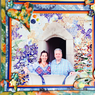
The photo in the challenge reminded me of the AMAZING Casa Batllo', that we visited in Barcelona, Spain.  This building was on my bucket list to one day see and tour it, for 7 years! We didn't have enough time to tour it on our first trip to Barcelona in 2007. When we returned there in 2014, I made sure we visited it, and even pre-purchased the tickets on line before we departed!!  

Every inch of what was once an apartment building, that was designed by the amazingly talented and super creative Antoni Gaudi, holds something beautiful for the eye to see! The windows, the staircase, the attic, even the chimneys and balconies!

I drew my inspiration from the colors, and from the style of this work of art, and that fact that it is a piece of "ART."  Here is my layout for your inspiration!

This photo was taken by the staff there, as we stood out on the balcony at the very top of the building.
They had a camera mounted out in front of the balcony.  Let me tell you, my hubby wasn't very happy about standing  out on a balcony up that high, but he is a very good sport, and knew how important taking this photo was to me.  I LOVE all of the broken pieces of tile that cover the building - both inside and out!  Gaudi is credited with creating this mosaic style called "Trencadis" (mosaic made from broken tiles) and it can be found throughout his works in Barcelona.

Below you can see the arrow pointing to the balcony where we stood for the photo!  I made a pocket with the bookmark showing the picture of the full building, that I bought in the gift store, and tucked a journaling tag inside it!


The title "Casa Batllo'"  was actually the cover for the folder that the photo that we purchased came in.  Above you can see the journaling on tag that I tucked in the pocket.

I used various colors of Ranger Adirondack Alcohol Inks to color the chipboard elements on this page ( frame, hearts, swirl) - just randomly dropped them on.
I love how the chipboard came out. I think the base page - Paper House's Colorways "Sapphire" Collection was the PERFECT paper to use for the base!  I added a few Prima Flowers, some blingy gems, and enamel dots as added accents around the layout and called it a day.

I hope you enjoyed this little trip to Barcelona!  If you are ever there - please go see Casa Batllo' !

Please consider playing along with us at The Challenge YOUrself Blog this month!  I can't wait to see how you interpret this month's challenge, and what you come up with!

((HUGS)) ~ Sherri

Friday, August 5, 2016

August Scrap Our Stash Book Cover Challenge "Tracy Arm"

Happy August everyone!  I hope this summer has been treating you well, and you have had the chance to make some wonderful memories!

Here is our Book Cover Challenge over at the Scrap Our Stash Blog, for the month of August:


Use the above Book cover to inspire you when creating your layout, and be sure to include a decorative paperclip!  ( don't have a fancy one in your stash? how about a colored one? or maybe wrap some ribbon, fibers or washi around it and turn a plain old paperclip into something special!)


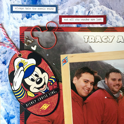
And here is my layout for your inspiration.  The book cover reminded me of "travel" so I dug through our vacation photos and selected this FUN shot from our Disney Alaska cruise in June of 2015.  I so LOVE this shot of our family, at one of the most beautiful places in the world!

I love non-sketch challenges as they allow me to get creative with odd size or large photos.  This is one of my favorites from our cold, and rainy, but BEAUTIFUL day at Tracy Arm, on-board the Disney Wonder!

The oval with the date, and the Mickey head with the plaid cap are graphic files that a fellow cruiser shared.  I printed them on glossy photo paper, cut them out and added them with foam dots to this little cluster in the corner. 

I love to collect beautiful moments, don't you? These small talk stickers are a fun way to add sentiments to a layout.  I matted them on cardstock and pop-dotted them for dimension. I am so happy I selected this background paper as the base! It screams "frozen" and "cold" - which we were!

The Captain Mickey tag is actually given to cruisers on the last night of the cruise, to attach to our luggage, and assist in sorting and locating it for pick up after we disembark.  I was sure to save one as I thought it would make a great embellishment!  You can also see the FUN Mickey paperclip that I picked up in Disneyland earlier this year - LOVE IT!!

If you've visited my blog before, you know I love to make hidden pockets with foam tape, to slip a journaling card in, behind photos. I used some fun Disney washi tape as a pull for this one.

Here is the front of the journaling card.  I also matted it to cardstock and wrote on the back as you can see in the photo below.

Items used:
Scrapbook Customs : Iceberg, Mr. Lumberjack, Alaska Vintage Journal
Tim Holtz - Small Talk Stickers
Ranger Distress Stains : Picket Fence, Candied Apple, Blueprint Sketch
Washi Tape
Mickey Paper Clip - from our trip to Disneyland!

As always, THANK YOU for stopping by, and taking the time to read my blog.  I hope it inspires you to CREATE and play along with us this month at the SCRAP OUR STASH Blog!  I can't wait to see what you come up with!

((HUGS)) ~ Sherri